


A few years ago, I stood in our kitchen washing dishes and overheard a conversation in our living room. I turned off the water and listened to our youngest daughter engaged in a full back-and-forth with Siri – the virtual assistant on her tablet.
Her rudimentary conversation, while hysterical, became a preview for the emerging relationship we have with artificial intelligence (AI) tools like ChatGPT and Copilot. Today, these AI chatbots have the capacity to answer our questions in complete sentences, edit themselves for tone, and learn from the prompts we give them. When we use AI as a tool, it has the potential to save us time, distilling thousands of data points down to the most important details.
This year, we’re taking a deep dive into the data element of PBIS implementation. Across all three tiers, data are essential for monitoring your progress and improving outcomes in your building. Follow along as we explore what it means to use data to drive decisions.
This article isn’t about using AI, but as I sat down to write about data and the way your teams use it to drive the decisions you make, I couldn’t help but wonder how technology like AI changes the work your role in the process.
Your school collects lots of data related to the school day. There’s basic demographic data about the students enrolled. You have access to assessment data and standardized testing data. Behavior data like referrals, point cards, and individualized education plans (IEP) help you monitor the support you provide across all three tiers of PBIS implementation. The pile of data you have available at your fingertips is overwhelming. AI can help us comb through the clutter by analyzing the data and calling our attention to the trends it sees.
To make sense of those data, artificial intelligence benefits from some (a lot of) human intelligence.
ChatGPT isn’t active in your classroom. It doesn’t have a relationship with your students. It won’t hear the noise level in the cafeteria or understand the way it feels to walk down the hallway after an assembly. Your experiences, instincts, and expertise continue to be an integral component to the decision-making process. So, what exactly is our human role in using data to make decisions? It just might come down to the questions you ask.
Data and Decisions on a Spectrum
If someone asked you if you and your team use data when you make decisions, what would you say? When Researchers Gina Schuyler Ikemoto and Julie A. Marsh asked school teams whether they used data to make decisions, most teams described themselves as “completely data-driven" basing all their decisions on data.1
Pretty great, right?
Those same researchers asked a simple follow-up question: What does it mean to be completely data driven? No one had a common set of steps or even a shared language to describe the processes their teams used. What researchers did notice was the way the data and decision-making processes landed along two continuums, from simple to complex.
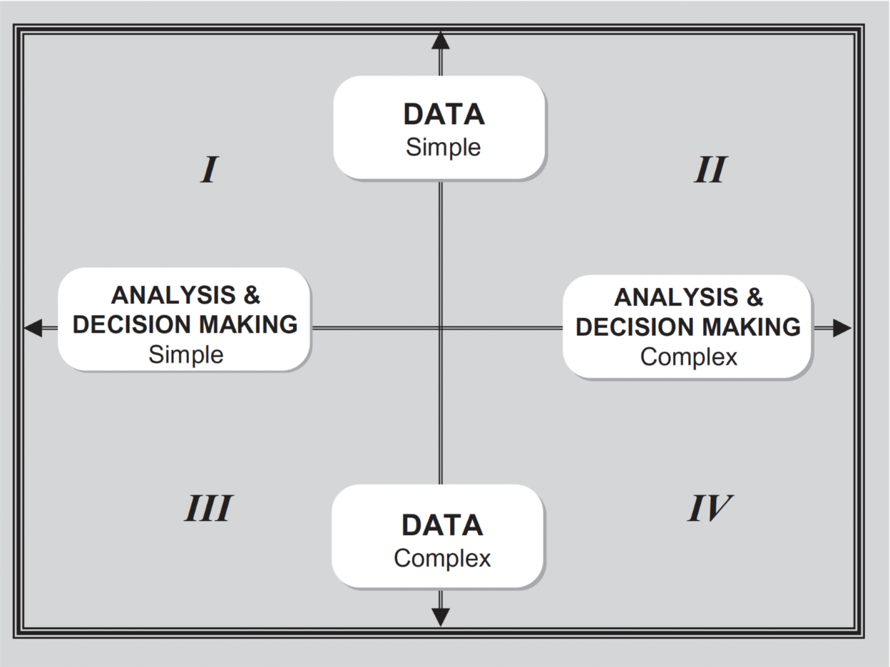
Each of the 36 teams fell into one of these four decision-making models depending on how complex their data and process got.
- Simple data + Simple analysis = Basic decision making
- Simple data + Complex analysis = Analysis-focused decision making
- Complex data + Simple analysis = Data-focused decision making
- Complex data + Complex analysis = Inquiry-focused decision making
Simple data didn’t always require a simple process and complex data don't always require a complex process. Teams mixed and matched...and that's great. It's also true, according to this study, "the literature tends to emphasize the value of engaging in inquiry-focused" data-driven decision making. That is, when you have complex data, the decisions you make improve when you use a more complex process to analyze them. Your decisions should be more collaborative and iterative. Your team should recruit help from an expert – like a coach – to navigate the process. Decisions involving complex data almost certainly require insights and expertise found outside AI algorithms.
One inquiry-focused approach lots of PBIS teams use is called Team Initiated Problem Solving (TIPS).
Using the TIPS process, school-based teams implement "the foundations needed to run more effective meetings, a process for using data to identify school needs and goals for change...and a process for using, monitoring, and adapting solutions."2 The approach makes a big difference! Teams are able to identify problems early, develop practical, culturally responsive solutions, implement those solutions with precision, and document the benefits for students.
The first step in the TIPS process is to identify the problem. This is a step in most decision-making frameworks out there. (Spoiler alert: It’s also the first question our guest on this month’s podcast episode asks of any dataset.) The trouble is, how do you do that? It all comes back to asking the right questions. As your team works to identify the problem you want to solve, here are some of our favorite follow-up questions (in no particular order) to get you closer to naming it with precision.
How Do These Data Compare?
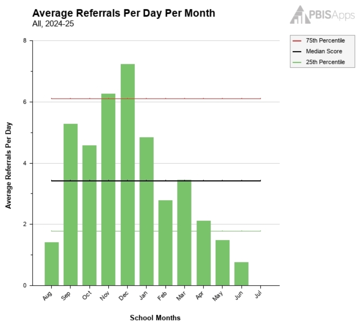
Normally, I’m not the kind of person to recommend comparing yourself to other people. We’re all on our own journey. There is no judgement here. However, when you're trying to figure out whether you have a problem to solve or not, it’s helpful to start with what’s typical or average. For example, in the graph above, we’re looking at our school’s Average Referrals per Day per Month graph in SWIS. There are a few comparisons we can make here:
- Over Time: We can compare green bars. In December, we can see our average is higher than any other month so far. We might decide we need to make a change. In June, we see that steady decline in referrals during the second half of the year. We might decide to celebrate this success rather than explore a problem.
- To Other Organizations: The horizontal lines on the graph show us how our averages compare with other schools our similar size. The black line is the median. The red is the 75th percentile and the green is the 25th percentile. This comparison shows us not only were those first five months challenging for our school, those rates were also higher than most schools our same size.
Knowing what’s typical for your school and what’s typical for most schools helps you know where you stand compared to that baseline.
What Do We Know About the Peaks and Valleys?
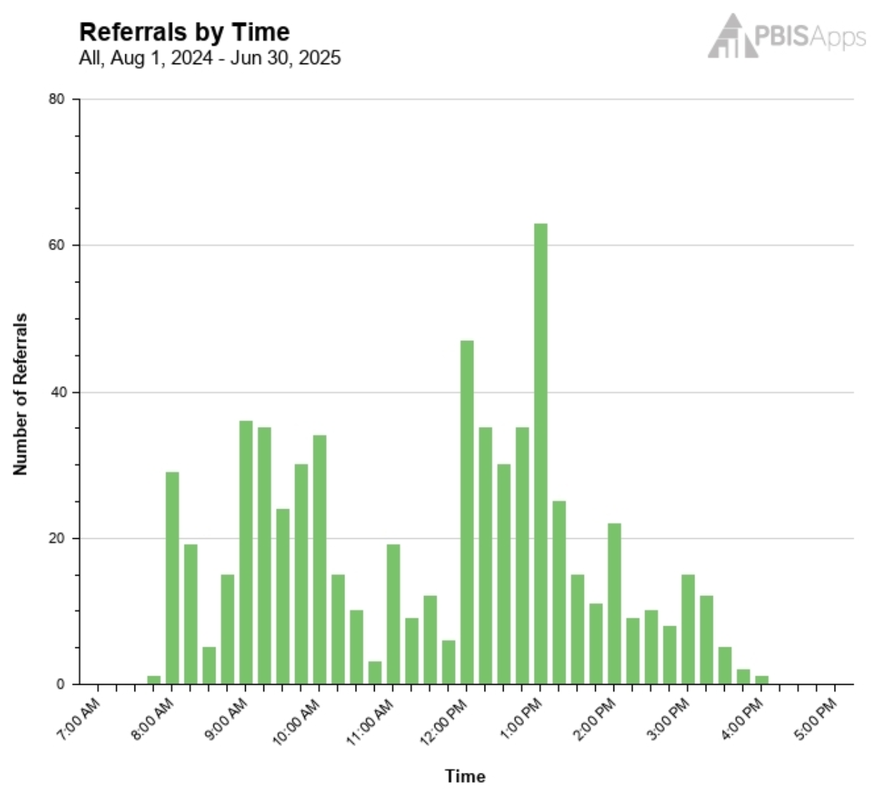
Sometimes graphs do a nice job of calling your attention to interesting trends. When the bars spike high or dip real low, it’s usually a good idea to spend some time looking a little more closely at what’s happening there. For example, this is a Referrals by Time graph from SWIS.
Where does your eye go?
Mine goes immediately to 1:00 where more than 60% of our referrals seem to happen. If these were your school’s data, your team would probably know what’s happening at 1:00 every day. You might have personal stories to share or carry some background information about why behaviors seem to spike around that time. The point is, 1:00 is a conversation starter.
So is that hour between 10:45 and 11:45 where behavior is surprisingly low compared to other times during the day. It’s important to pay attention to the spaces where data indicate success. Not everything is a problem to solve. Sometimes, it’s something to try and replicate in other areas.
Do These Data Match Our Expectations?
There are times for data to point you in a direction and there are times when it’s important to bring your personal experience to the graph in front of you. It brings to mind a quote I recently stumbled across: “The data people use may differ. The interpretations may differ. Even the same data may mean different things to different people. Data, in and of themselves, are meaningless. They are simply numbers. Data gain meaning through context.”3 You bring that context to the discussion. Looking at these data through that lens, what do you notice?
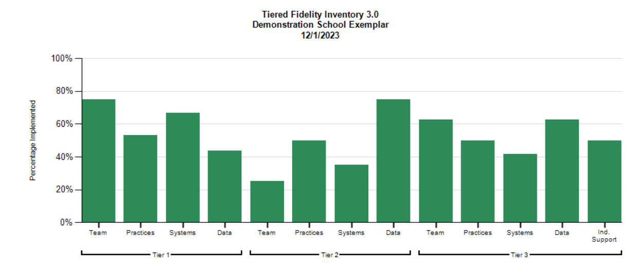
The graph above is an example of a Tiered Fidelity Inventory 3.0 (TFI) Subscale Report. The Tier 2 scale catches my eye, particularly the Team subscale. If I’m on the Tier 2 team, I have a personal connection to that subscale. I know we’ve had turnover this year and we’re missing representation from parents and some grade levels. I also know we don’t have a solid procedure in place for recruiting support from our Tier 1 and Tier 3 teams. That one bar makes sense to me, and my mind moves quickly toward problem solving.
Each team member could look at the graph above and tell a story about a green bar on the screen. Those stories are important; they define the context. So, talk about them!
What Are We Curious to Know?
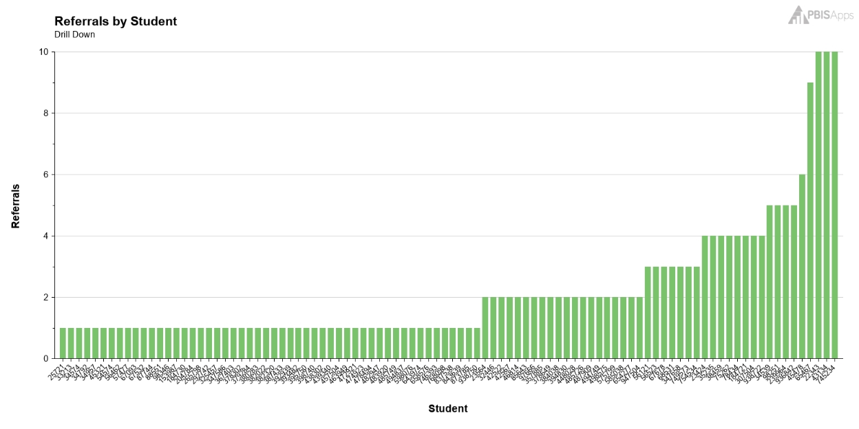
There are times when one graph speaks volumes. There are other times when one graph leads to more questions. In his TED talk, “Why everyone should be data literate,” Jordan Morrow challenges us to become curious and ask questions of everything.4 When you’re curious, you start defining what you see with precision. When you define your data story with precision, you can answer these questions:
- What is the problem?
- Where is it most likely to occur?
- When is it most likely to happen?
- Who is most likely to contribute to it?
- Why are they most likely to do it?
Take our SWIS Referrals by Time graph from earlier. I’m curious about what’s happening specifically between noon and 1:00. I want to know if it’s a few students or a lot of students contributing to those referrals. I use the Drill Down tool to look at that hour and low and behold, it’s a lot of students. We have a system-level issue to work on as a team, and I have more questions I want to ask.
When it comes to using data to drive our decision making, technology is an incredible teammate in the process. Computers are able to synthesize large datasets and deliver analyses in seconds. The data systems you use are important, but we can’t overlook the human element of the process, too. Whether your data and process are simple, complex, or a combination of the two, the questions you ask give the whole thing meaning.
This year, we’re taking a deep dive into the data element of PBIS implementation. Across all three tiers, data are essential for monitoring your progress and improving outcomes in your building. Follow along as we explore what it means to use data to drive decisions.